Lee Mikyung
Once every year, I send a memorial to the emperor (i.e. the new director of the Art Institute) -- giving him valuable advice concerning the administration of his empire.
I realize that -- given my bad attitude -- were this a real emperor/empire -- I would have been beheaded several years ago -- but Mr. Cuno tolerates my opinions -- and is actually kind enough to write me in reply.
The problem is --- whatever I raise an issue -- he addresses it -- but not as I would have wished.
For example -- on one of my walks through the galleries, I discovered the following piece:
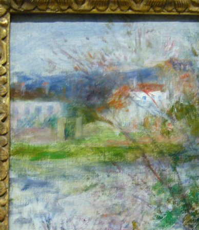
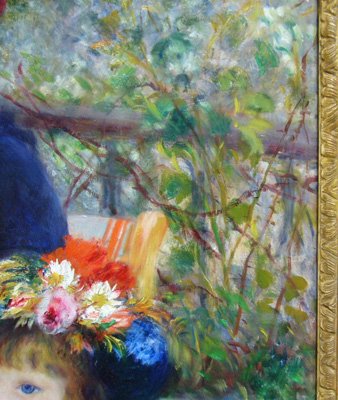
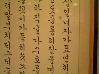 Ode to Balsam Flowers (detail)
The above is a small section of a 4-screen , 6-foot high, display of calligrapy --
by the Korean artist Lee Mikyung. According to the label, the script is an anachronistic, Korean style preserved by aristocratic women ( while their husbands preferred to write in Chinese characters).
Lee Mikyung was born 1918 -- and this piece was done in 1991 -- so chronologically, she would be considered a contemporary artist. (everything done after 1950 is now considered "contemporary")
I'm glad the piece is being shown --- it's a bit regimented/formal -- i.e. the characters don't seem to play with each other very much --- but each one is wonderful to study -- and god knows there are enough of them.
When I wrote to Mr. Cuno, I asked why this traditional Korean contemporary calligraher was on display --- but not-one-single traditional Euro-American -style painter was on the walls. (and god knows there are enough of those -- painters of portraits/landscape/still-life etc) Why should traditional Korean culture be honored -- but not our own ?
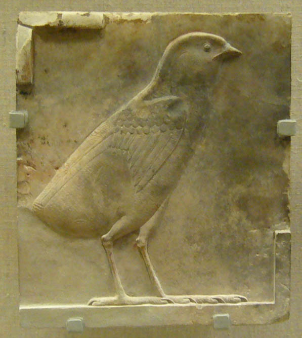
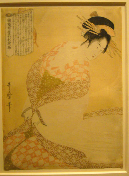
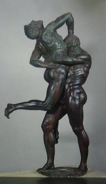
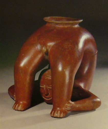
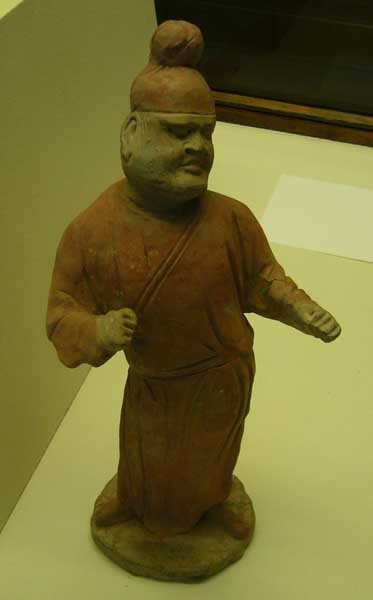
Last week I discovered that this problem had been solved: the Lee Mikyung had been sent to the basement -- and a different ( and much older ) Korean painting was now on display.
I suppose this is just a coincidence --- but in the same memorial, I asked why members should wish to renew their membership to the museum -- since the admitance fee is "pay what you wish" -- and the only real benefit was free admission to the high-priced special exhibits (which new museum policy has discontinued)
And now -- I have just learned that "pay what you wish" will soon be replaced by "pay $12" (or some such amount)
So once again -- my concerns were addressed -- but not in the way I would have wished !
I realize that -- given my bad attitude -- were this a real emperor/empire -- I would have been beheaded several years ago -- but Mr. Cuno tolerates my opinions -- and is actually kind enough to write me in reply.
The problem is --- whatever I raise an issue -- he addresses it -- but not as I would have wished.
For example -- on one of my walks through the galleries, I discovered the following piece:
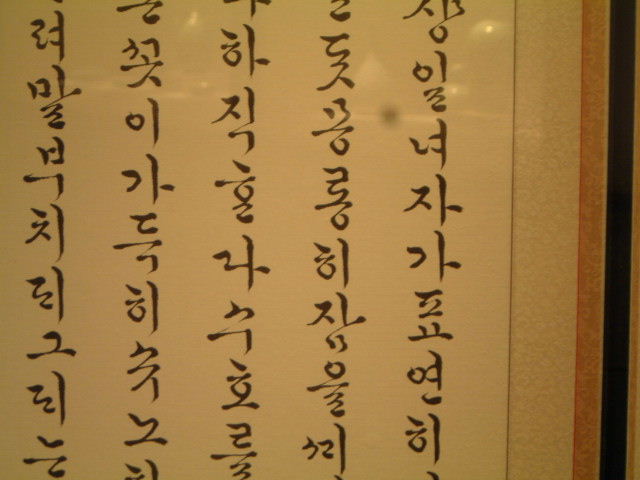 Ode to Balsam Flowers (detail)
 The above is a small section of a 4-screen , 6-foot high, display of calligrapy --
by the Korean artist Lee Mikyung. According to the label, the script is an anachronistic, Korean style preserved by aristocratic women ( while their husbands preferred to write in Chinese characters).
Lee Mikyung was born 1918 -- and this piece was done in 1991 -- so chronologically, she would be considered a contemporary artist. (everything done after 1950 is now considered "contemporary")
I'm glad the piece is being shown --- it's a bit regimented/formal -- i.e. the characters don't seem to play with each other very much --- but each one is wonderful to study -- and god knows there are enough of them.
When I wrote to Mr. Cuno, I asked why this traditional Korean contemporary calligraher was on display --- but not-one-single traditional Euro-American -style painter was on the walls. (and god knows there are enough of those -- painters of portraits/landscape/still-life etc) Why should traditional Korean culture be honored -- but not our own ?
Last week I discovered that this problem had been solved: the Lee Mikyung had been sent to the basement -- and a different ( and much older ) Korean painting was now on display.
I suppose this is just a coincidence --- but in the same memorial, I asked why members should wish to renew their membership to the museum -- since the admitance fee is "pay what you wish" -- and the only real benefit was free admission to the high-priced special exhibits (which new museum policy has discontinued)
And now -- I have just learned that "pay what you wish" will soon be replaced by "pay $12" (or some such amount)
So once again -- my concerns were addressed -- but not in the way I would have wished !
posted by chris miller at 6:52 AM
0 comments
![]()