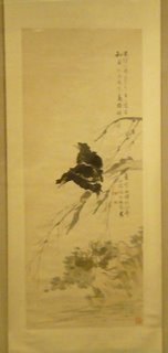
Ren Yi
 Ren Yi (1840-1896, Shanghai, Mynahh and Bamboo, 1892 -tribute to Zhu Da (17th c.)
The paintings on display in the A.I.C. Chinese gallery change about four times a year -- and usually I just don't care for them -- i.e. like all bad traditional art -- they just seem to be following a formula -- rather than using it to ascend to the heavens. The last exhibit of rock painters was unspeakably bad --- but this one, featuring the paintings of Ren Yi--- from the collection of Florence Ayscough -- was at least decorative -- and actually seemed related to the French, post-Impressionist decorative painters of the same era.
The exhibition includes photos of the collector, Ms. Ayscough, and properly emphasizes the role that local collectors play in a museum collection: i.e. a museum's collection is no better than the taste of those who have donated to it.
Ms. Ayscough was apparently a big fan of Ren Yi --- and the gallery walls are now exclusively dedicted to his works. They're facile -- showy -- elegant -- well-drawn --- reminds me of Singer Sargent's nearly contemporary portraits of English aristocracy --- but just like Sargent feels fluffy compared with the Baroque masters -- these painting proclaim a melacholy decline from the power of earlier Chinese painting.
I think the difference here is one of silk --- in the earlier masters, the blank silk behind the trees/birds/flowers is equally important -- so there's this tension of presentation -- foreground with background --- and a sense of eternity that is so delicious when contrasted with the brush strokes that feel so spontaneous/in-this-moment.
Without that tension -- the images just feel blowsy --- superficial --- and -- that horrible word -- decadent -- a feeling that's not diminished by the sensual colors which Ren Yi -- and the traditional Chinese brush painters of the 20th C. -- like to use.
(note: I couldn't photograph the other paintings because of the reflections on the protective glass case -- which also, by the way -- makes them difficult to see. Isn't there a better way to display this kind of thing ?)


0 Comments:
Post a Comment
<< Home